
MIRA — A Quiet Pause | Fragrance Brand Launch
Prompt
Create a five-slide, editable 16:9 English brand launch deck for MIRA, a fictional premium fragrance concept. Cover the idea of a quiet pause, its imagined Bergamot/Iris/Cedar note structure, bottle and packaging design, then a launch concept across film, social and in-store. Use warm ivory, charcoal and antique gold; generous whitespace, refined typography, distinct layouts and original product imagery. Keep copy concise and avoid real-world claims or fabricated statistics.
Result
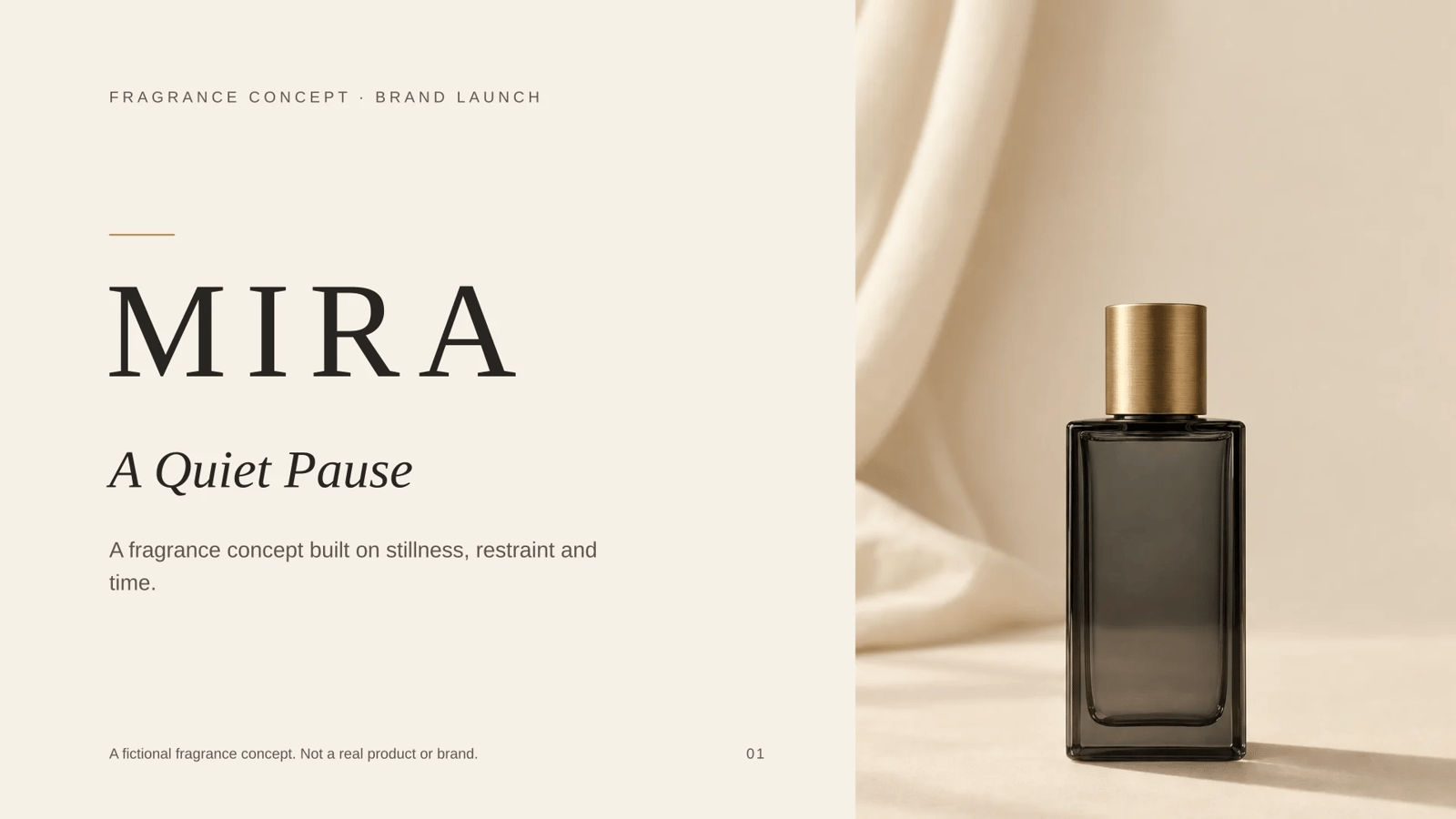
MIRA — A Quiet Pause — a five-slide, 16:9, fully editable English brand launch deck.
| # | Slide | What it does |
|---|---|---|
01 | Cover | MIRA wordmark, the concept line "A Quiet Pause", gold hairline, full-height bottle portrait, and a small line noting it is a fictional concept. |
02 | The Idea | A centred statement page — "A Quiet Pause" as the organising idea, three short supporting lines, and a wide still-life band of bergamot, iris and cedar. |
03 | The Scent | A stepped three-tier structure: Bergamot (top), Iris (heart), Cedar (base), each with one evocative line, labelled "Imagined note structure". |
04 | The Object | An asymmetric two-image page — bottle and packaging — paired with short FORM / MATERIAL / FINISH notes. |
05 | The Launch | A film still beside three stacked channel rows — Film, Social, In-store — each with a single concept line. |
Design: warm ivory #F6F1E7, charcoal #262523 with a muted tint for secondary text, antique gold #B08D57 only. Generous margins, serif display headings against small letter-spaced sans labels, thin gold rules, no shadows or decoration. Five deliberately different compositions.
Content discipline: every claim stays conceptual. The note structure is labelled imagined, the cover states it is a fictional concept, and there are no statistics, prices, dates, awards or performance claims — the only numerals are the note tiers 01–03 and page numbers.
Verified on the exported file: 5 slides, 15240000 × 8572500 EMU (exactly 16:9), 4 embedded images, all text as native editable text rather than flattened pictures. Deck validation returned zero errors and zero warnings.
Two things I could not independently observe: the generated images' freedom from stray rendered lettering (only the prompts and alt text assert it), and whether Georgia/Arial are embedded in your PowerPoint installation — they are widely available, but the file references them by name rather than embedding them. Say the word if you would like a different typeface pairing or a different crop on any image.
How it was made
- Mode
- Slides
Related presentation prompts
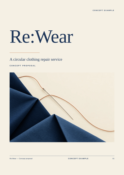
Re:Wear | Circular Clothing Repair Service Proposal
Presentation
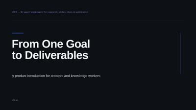
From One Goal to Deliverables | Introducing VIFE
Presentation
OPEN Kitchen | Community Shared Kitchen Concept Proposal
Presentation
The Life of a Star | From Nebula to Afterglow
Presentation
Volcanoes | Earth's Breathing Windows
Presentation
Tides: The Ocean Keeps Its Own Beat | Science Lesson Deck
Presentation
Starlight Library | Reading Trend Insights
Presentation
Design System | Quarterly Progress Report
Presentation